INTRODUCTION
Arnold Schalks invited thirteen graphic designers and typographers to design a new period.
CONCEPT: Typography is the profession that occupies itself with the design of texts to be printed. For that purpose, the typographer makes use of letters, images, lines, (white)space and colour. A specific field of the typographic trade is the design of typefaces. Originally, a typeface comprised only a roman type; the cursive, italic typeform was added later. Variations like 'light', 'bold' and 'condensed' followed, resulting in extensive typefonts. Prevailing styles and revisions in fine arts and architecture had a strong influence on the typographic design. The number of typefonts a present day typographer can dispose of is enormous. A visit to a random website, offering free downloadable fonts, produced over 20.000 typefaces with appealing names like 'Accidental Presidency' and 'Zodillinstisstirust'.
Nowadays, types are put through the wringer, broken on the wheel, rolled. Their contours are exposed to corrosive substances. Hardly any character escapes the designer's eye for innovation. Legibility has become a relative notion. Sofar, only one character got off scot-free. A breathing space.... A punctuation mark: the unspectacular, but crucial period.
Artspace de Vrije Schuur took this observation as a starting point for the project PUNT uit (POINTperiod). De Vrije Schuur invited typographers and designers (m/f) to tackle the phenomenon period. They were challenged to invent a new thrilling, revolutionary, final point. Many professional typographers consider it a sport to create the largest possible fonts with a maximum set of characters. In this case, austerity is required. The typeface to be designed and named will be reduced to one mere mark: the period.
ASSIGNMENT:
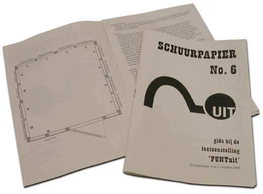
PUNTuit was the sixth event in artspace de Vrije Schuur. The opening took place on Friday evening September 30, 2005, from 19 h. on, and was also open on Saturday October 1 and Sunday October 2, 2005, from 12-18 h. 89 Persons visited the exhibition.
Click here to download 'SCHUURPAPIER #6' in pdf format / File size: 4,3 MB / © 2005, Rotterdam, Arnold Schalks.